深圳十奥设计顾问有限公司
Shenzhen / Tokyo
Mail : contact@codesignconsulting.net
Web : codesignconsulting.info
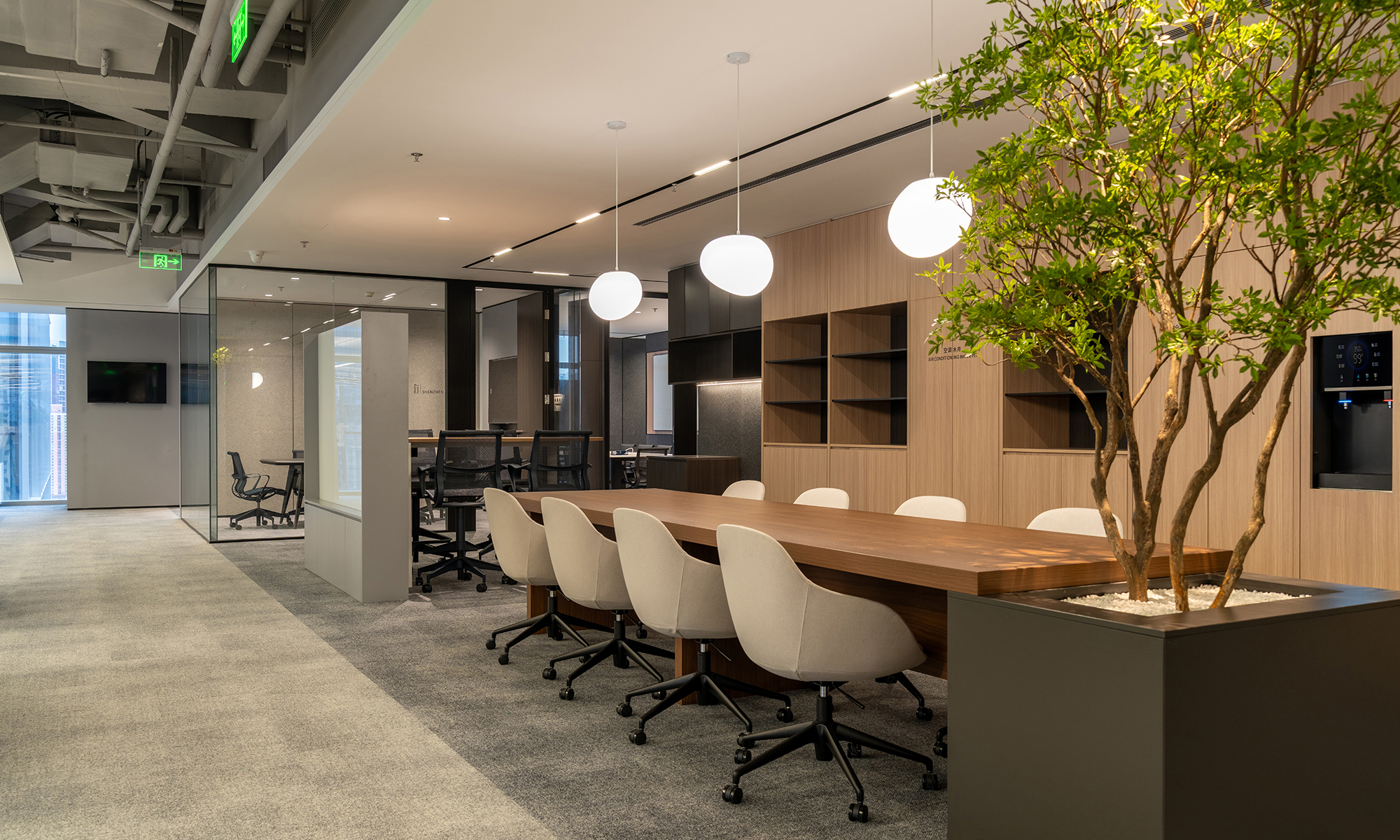
Yamazen Shenzhen Office
time : 2025.10
client : Yamazen ( Shenzhen )
area : 800m2
site : Futian, Shenzhen, China
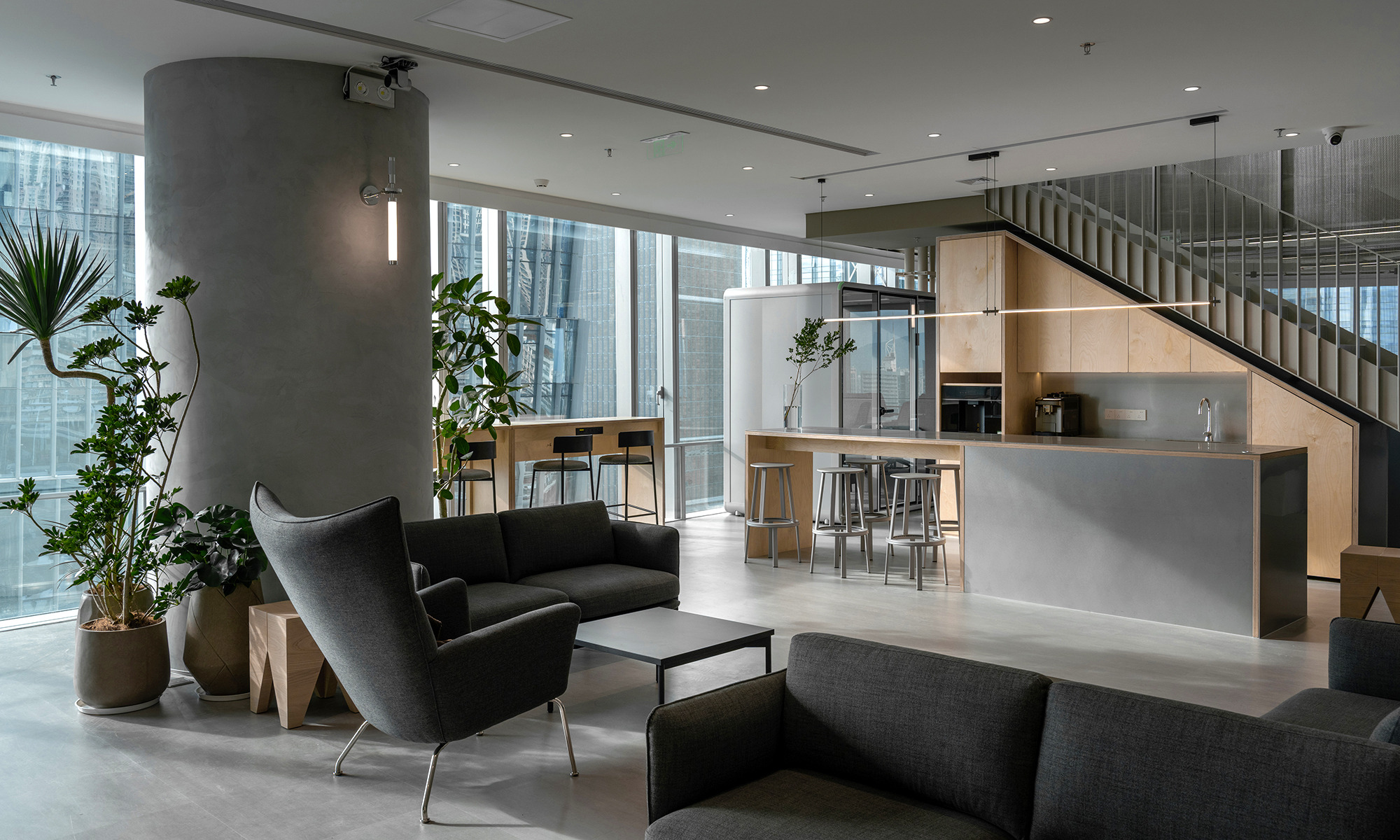
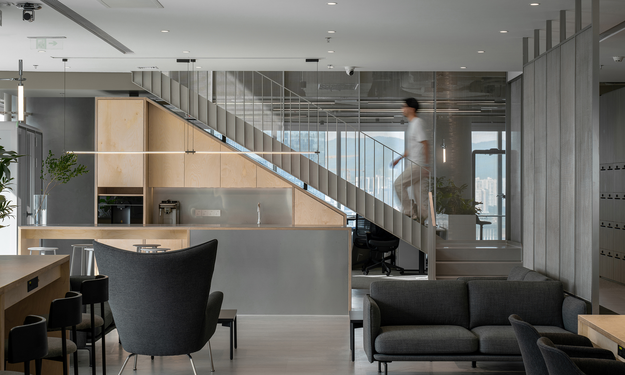
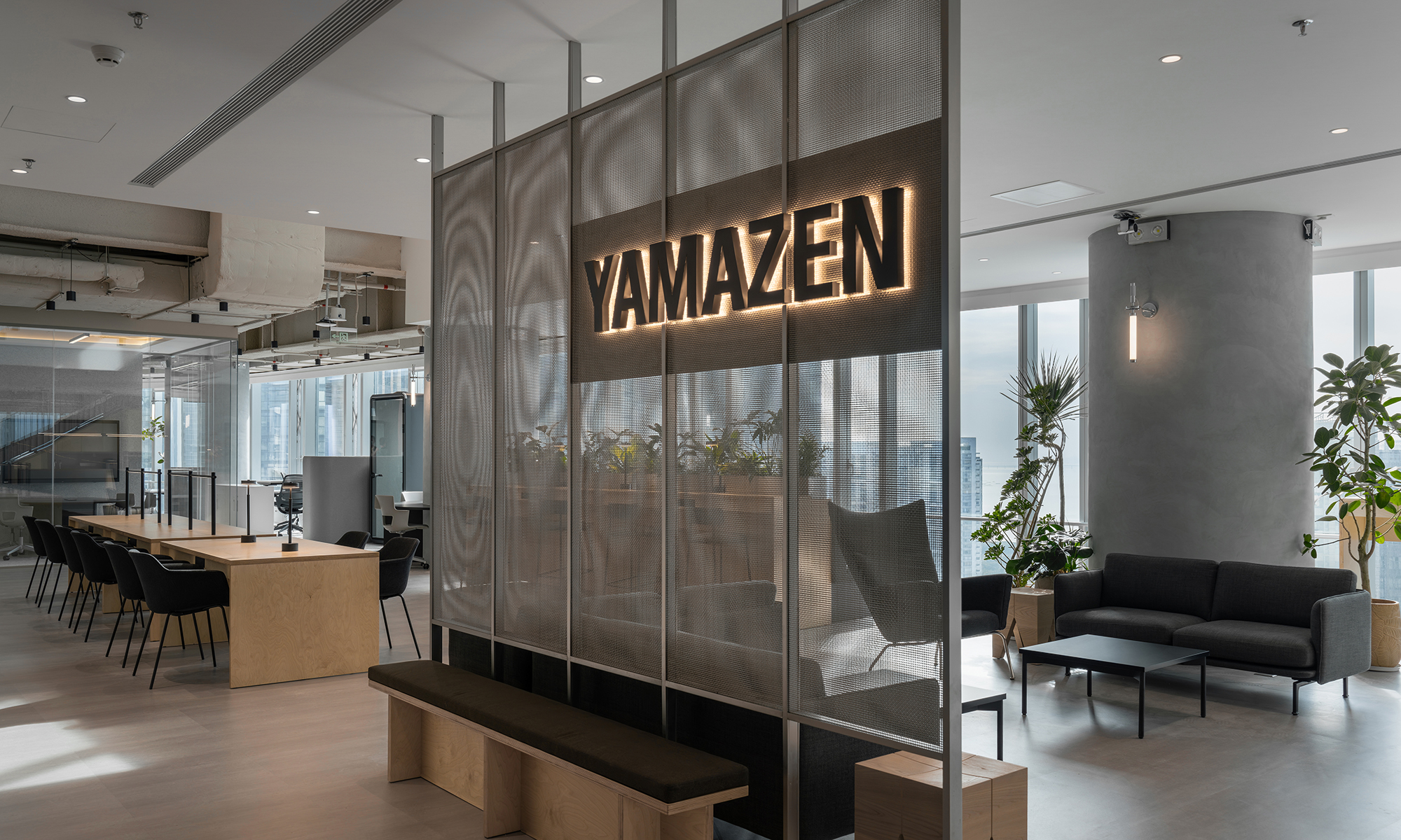
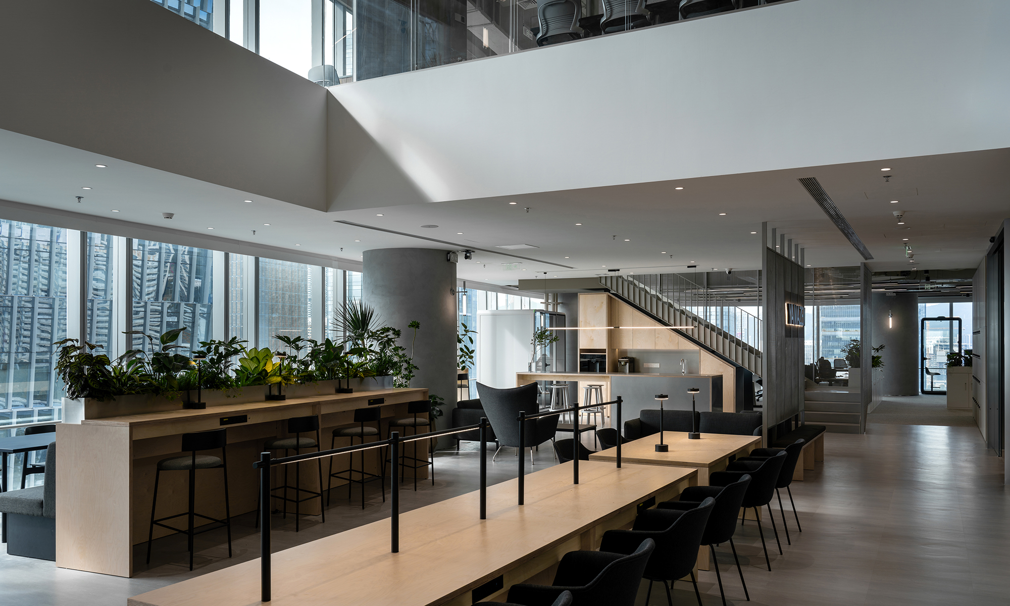
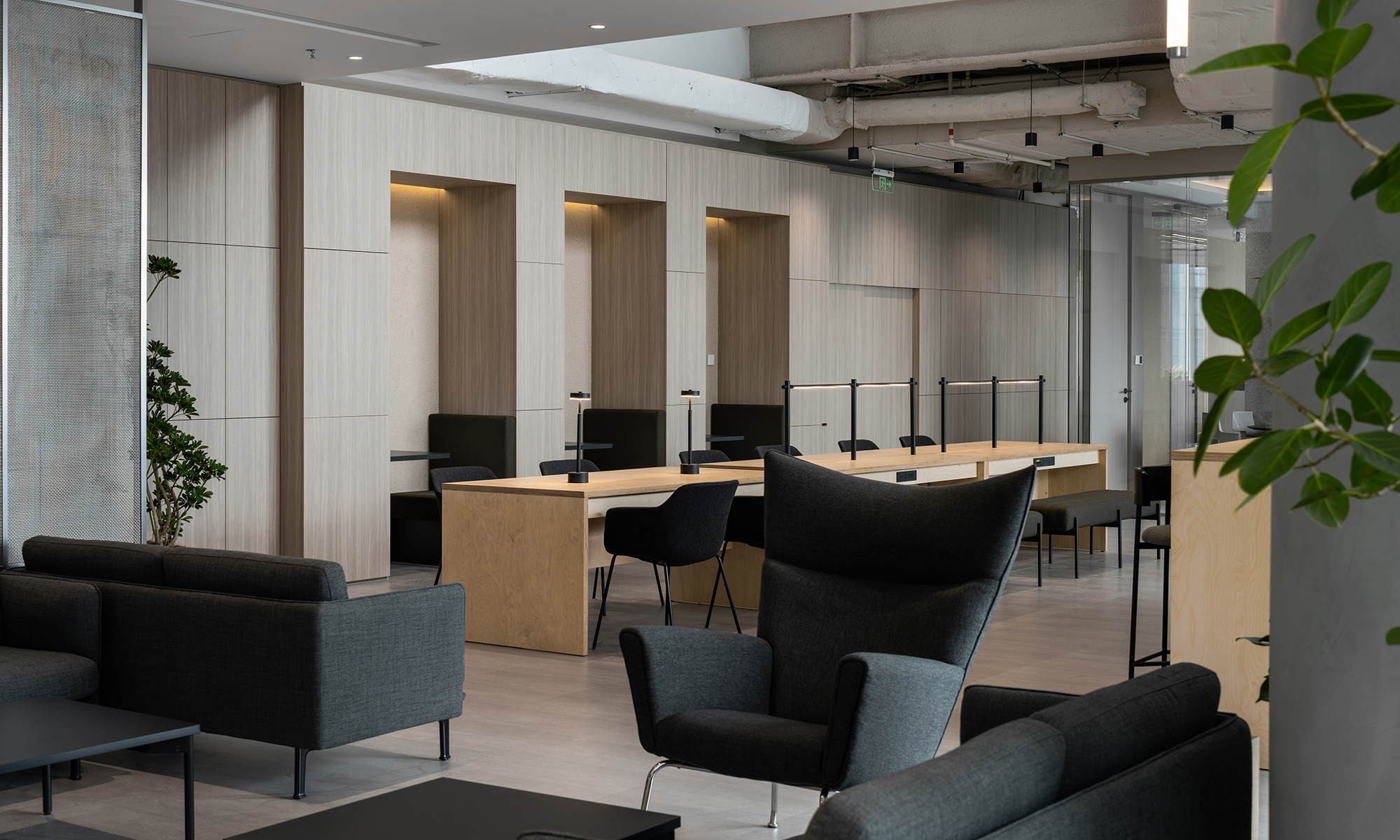
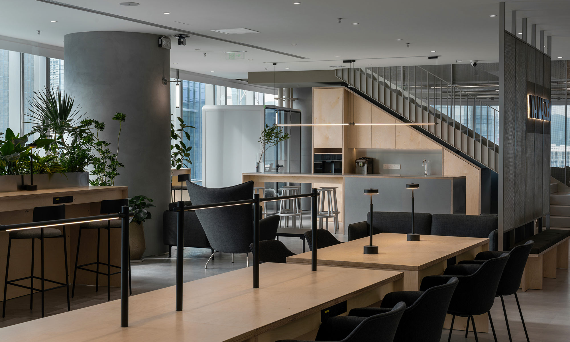
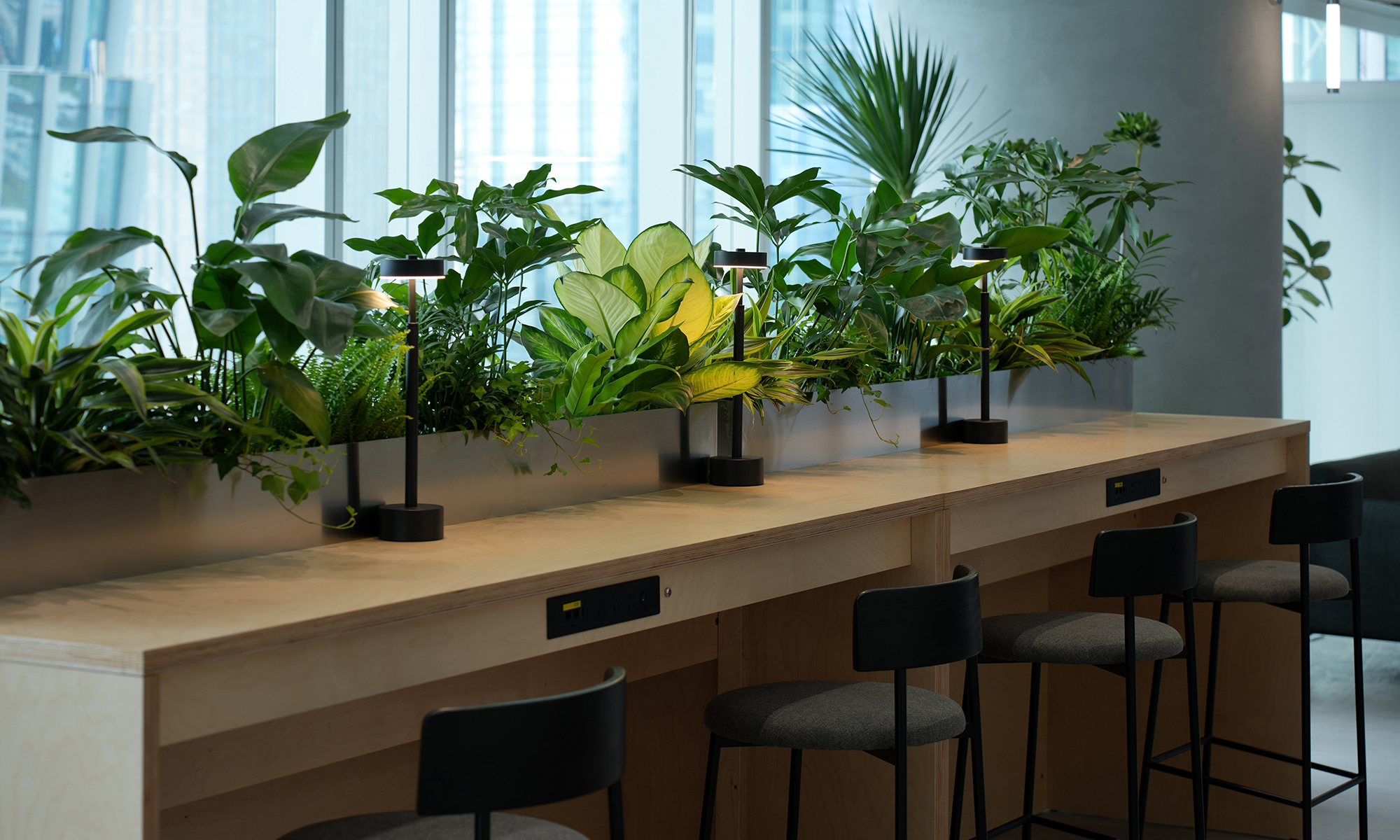
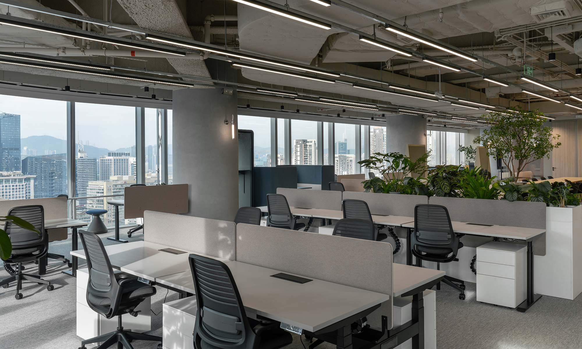
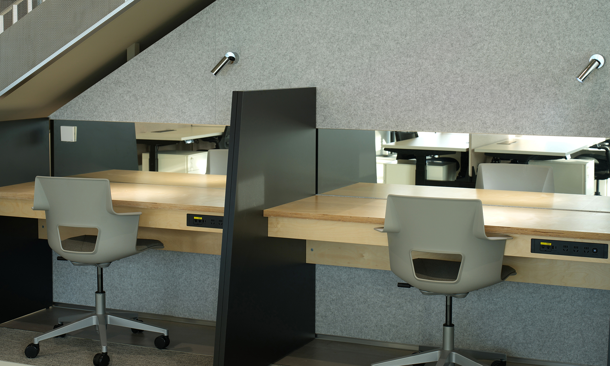
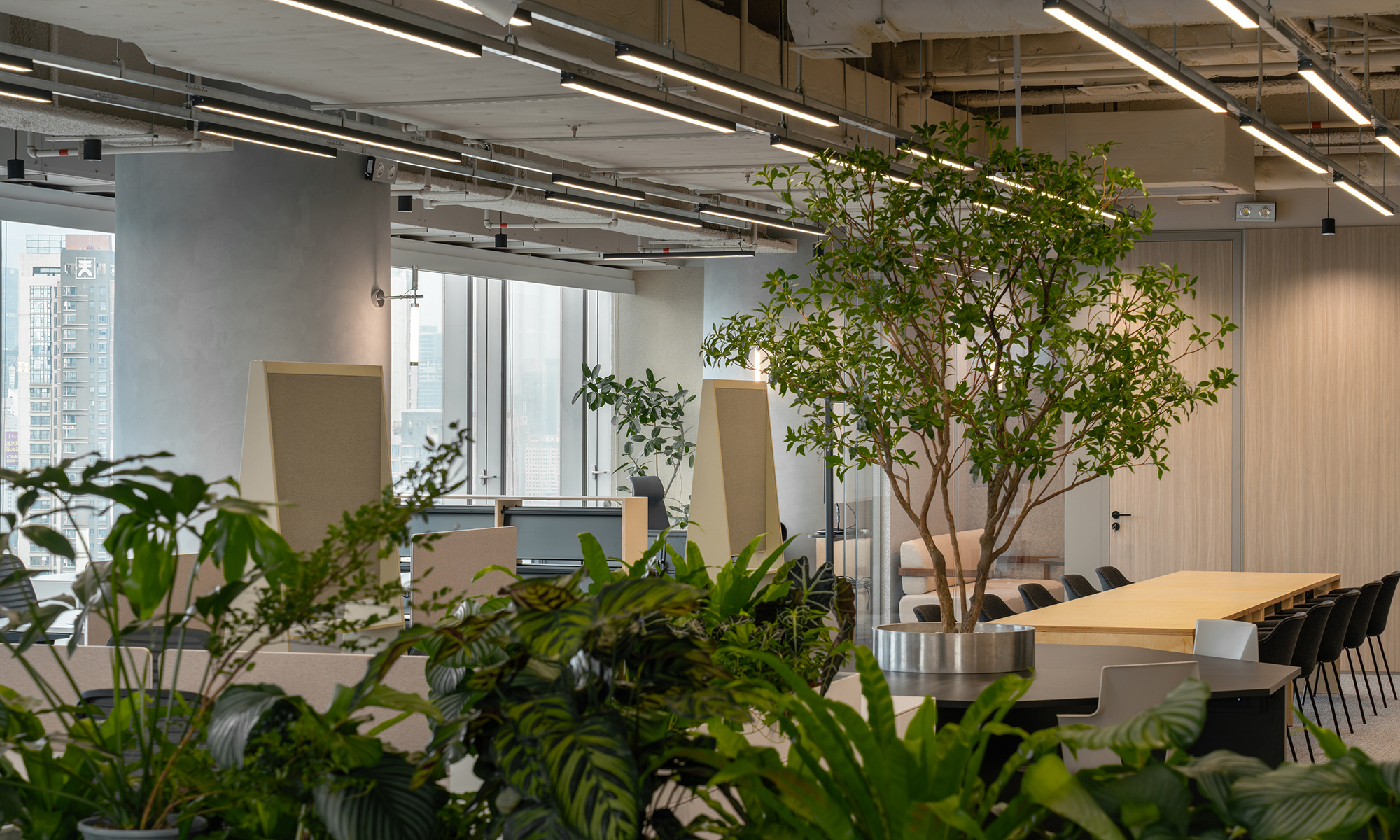
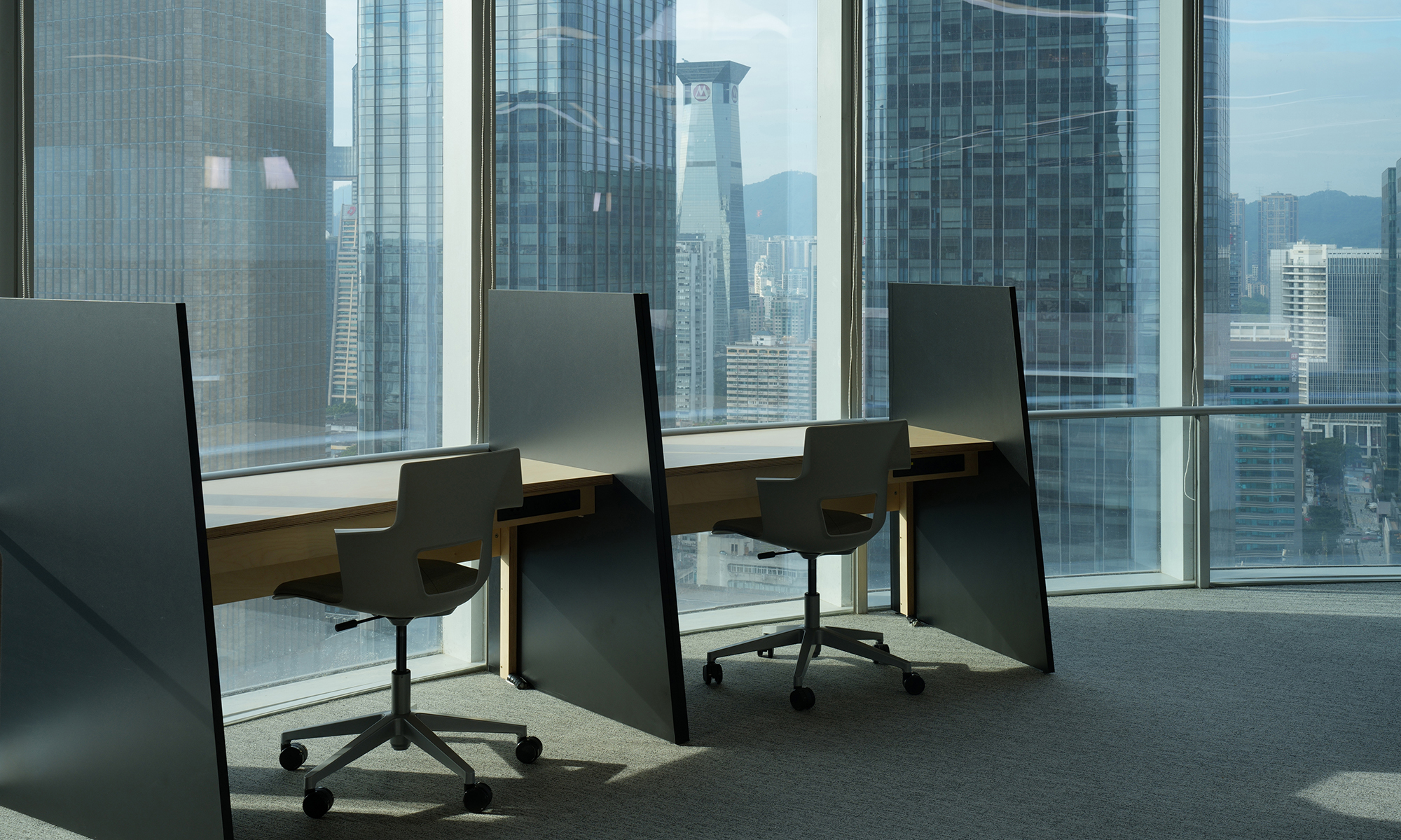
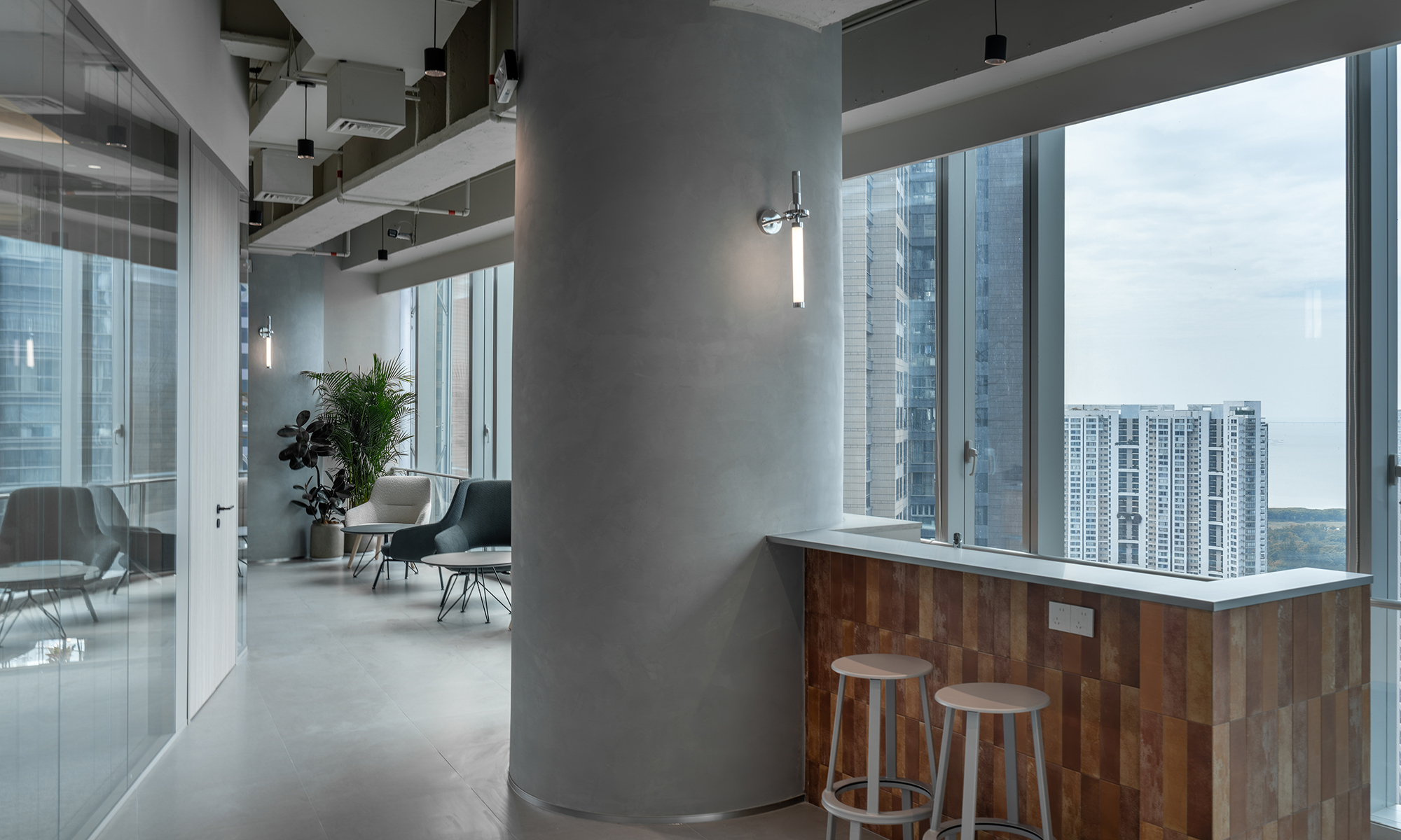
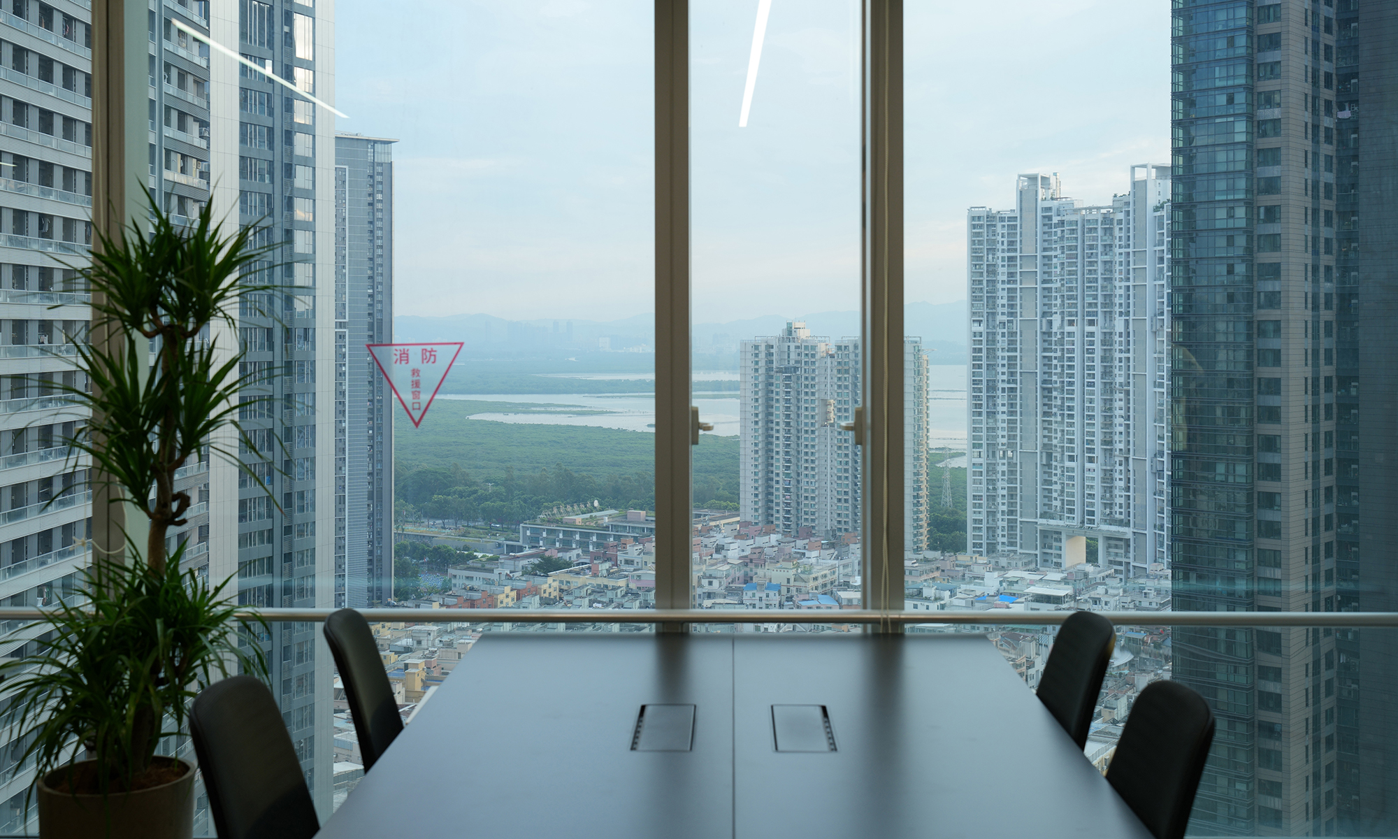
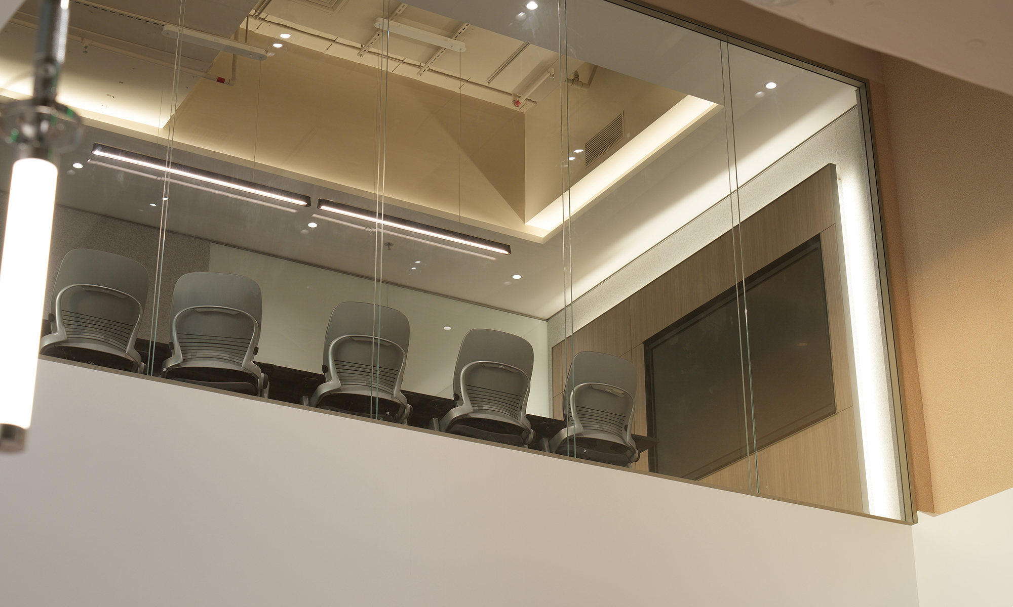
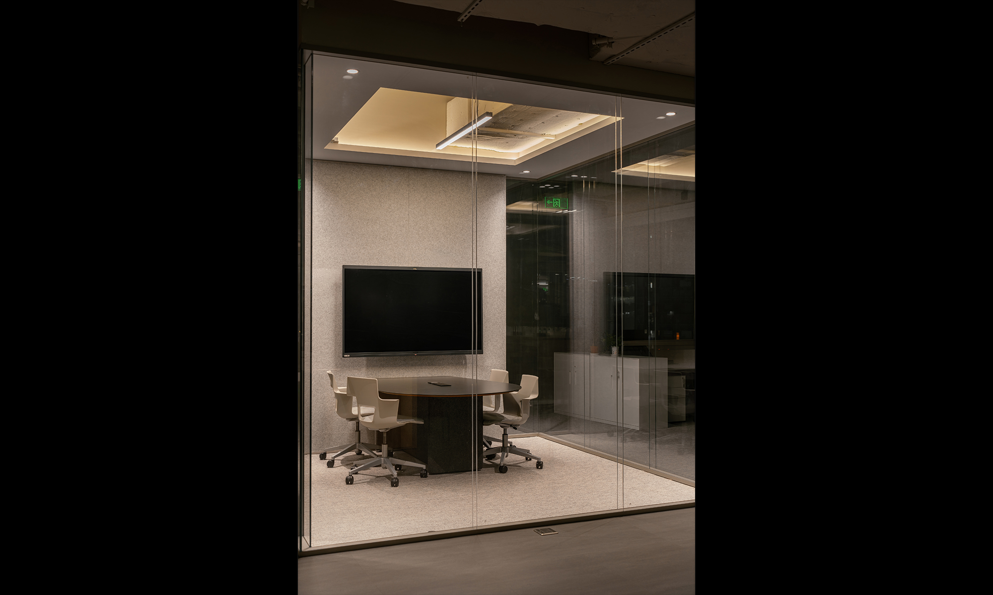
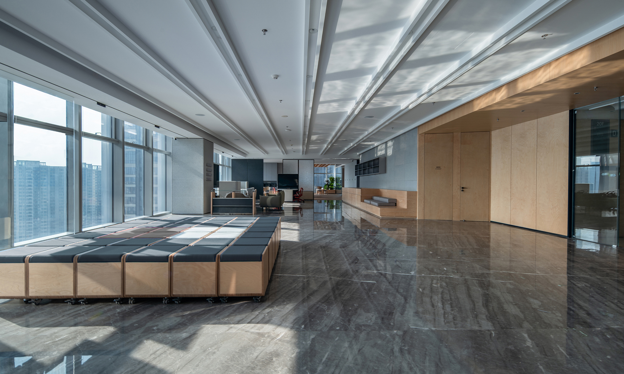
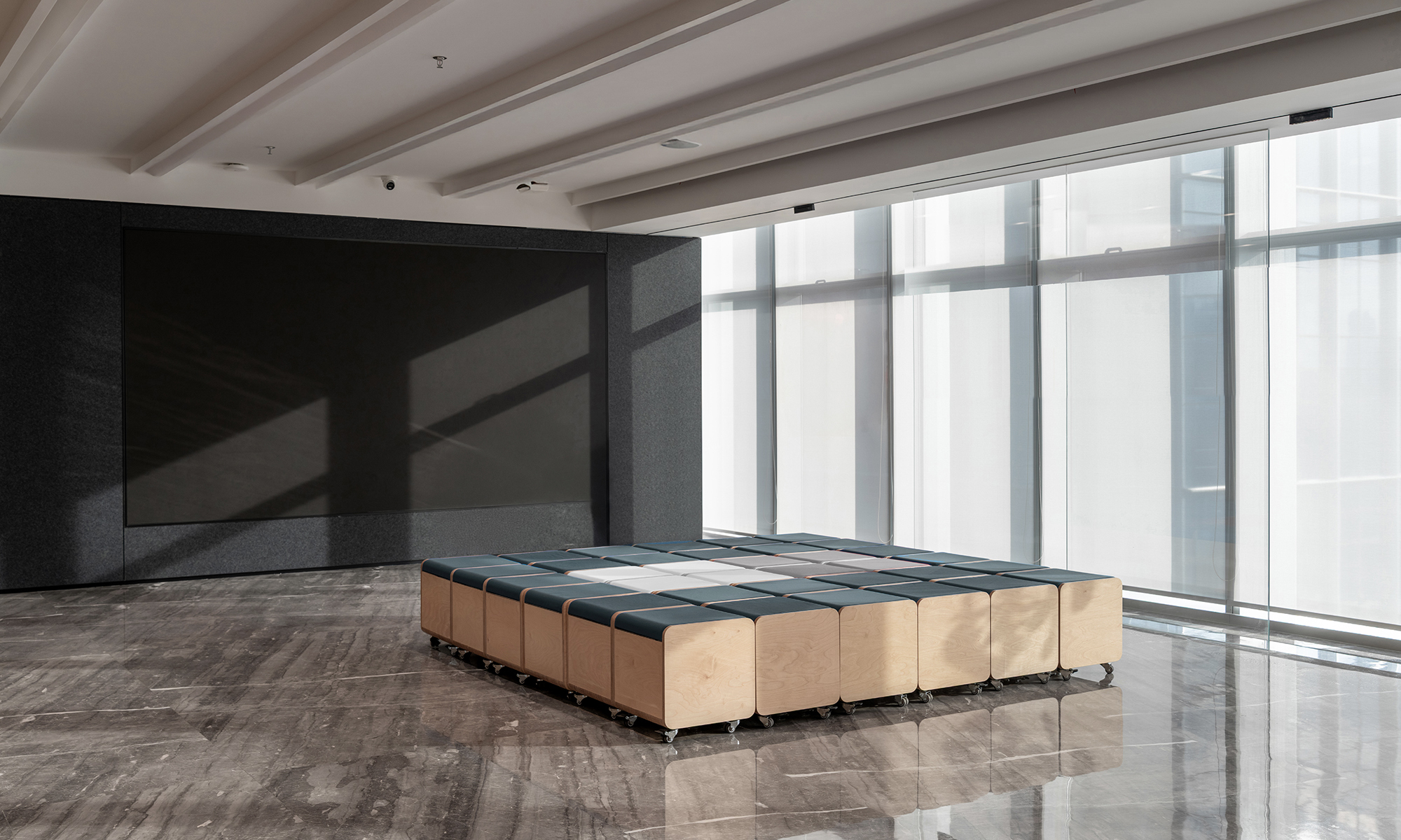
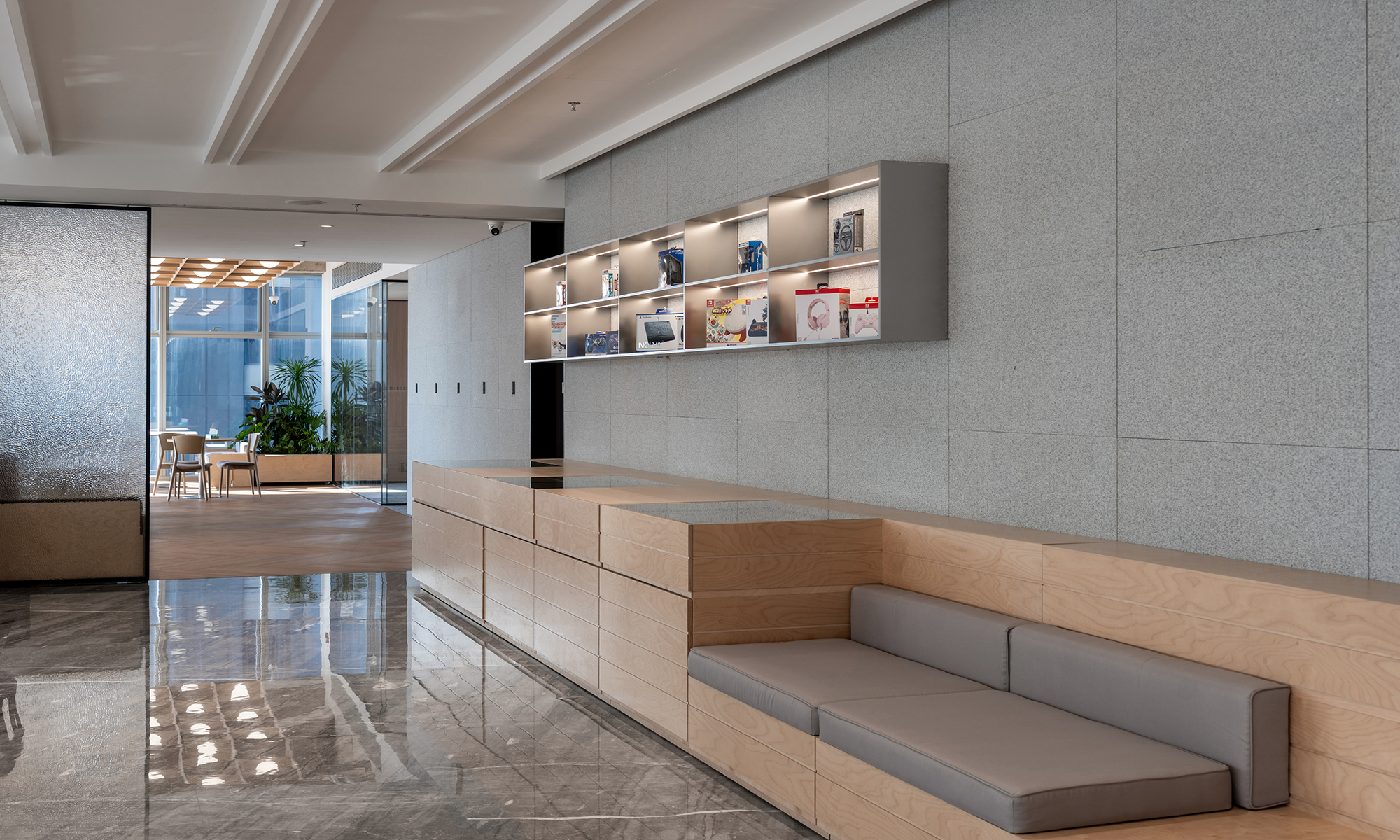
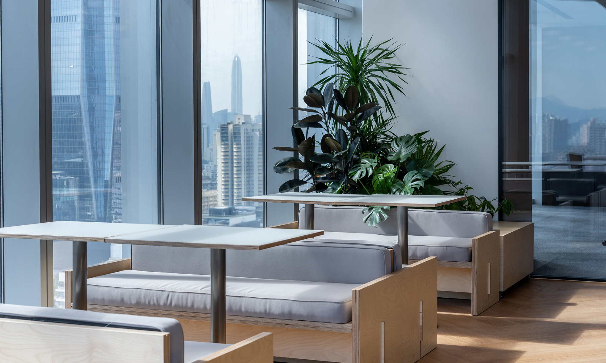
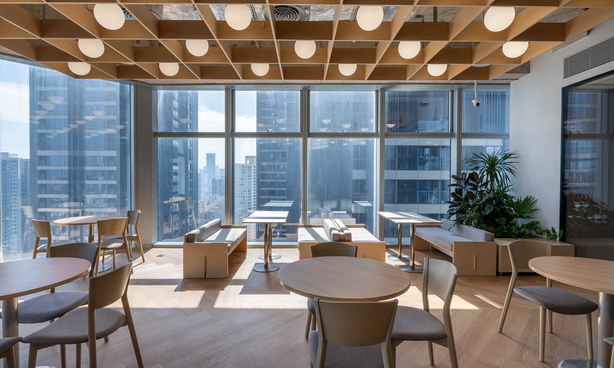
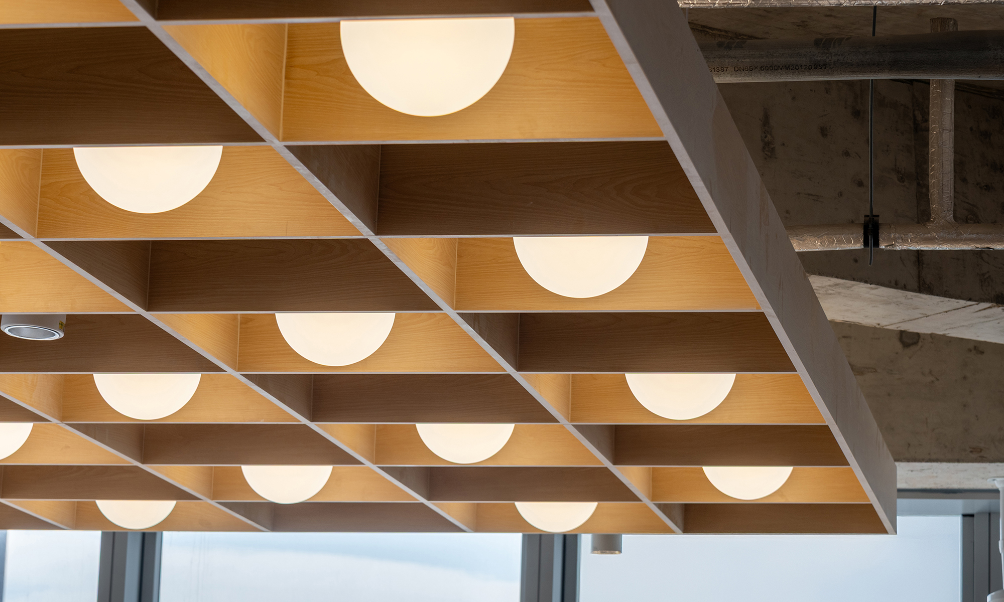
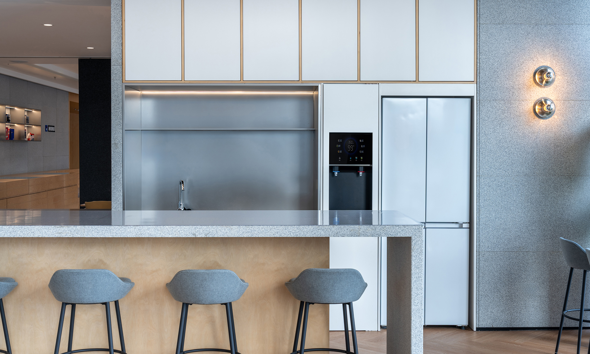
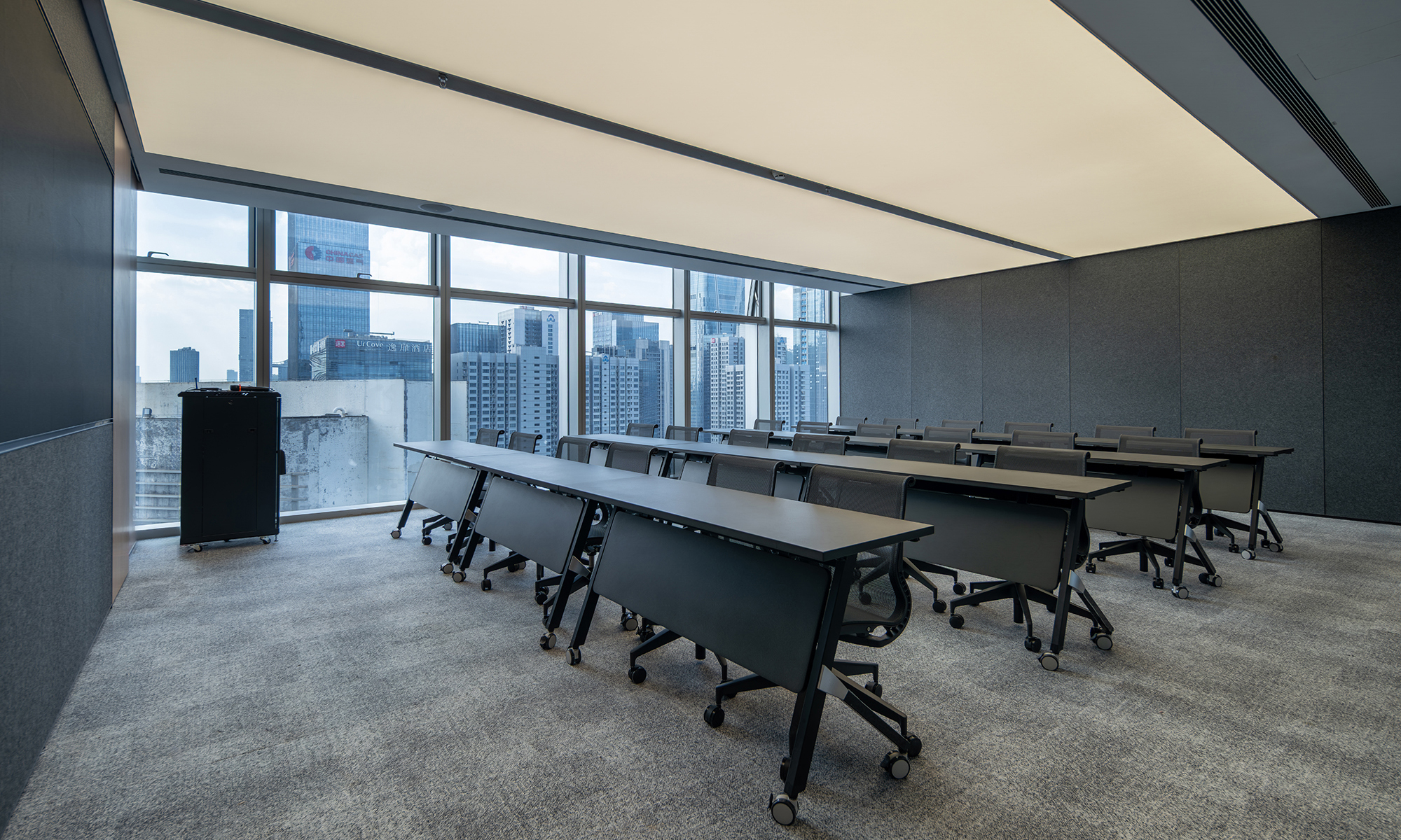
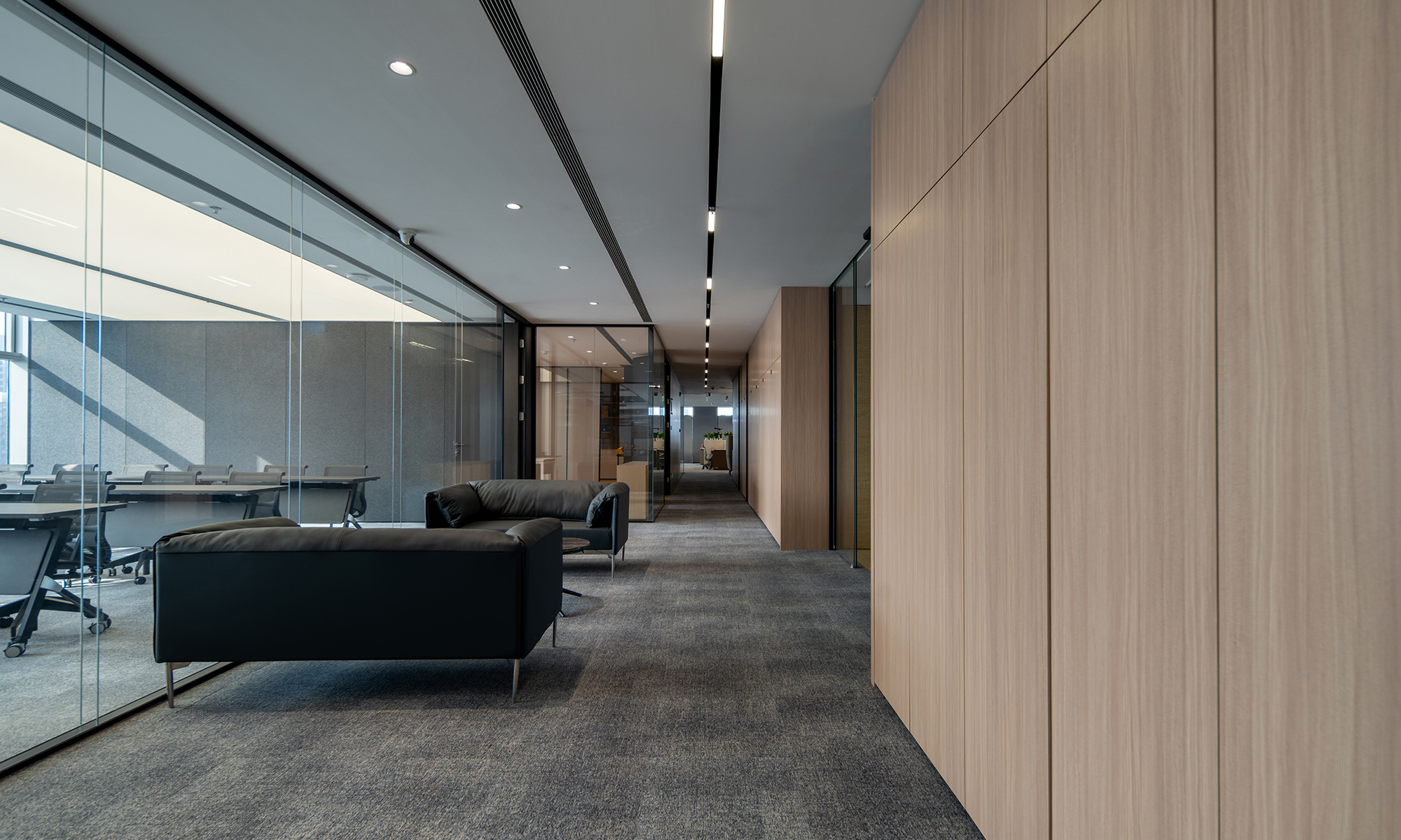
The client recognized a challenge in their existing office: its spatial configuration tended to make employees retreat to their desks, limiting casual encounters and collaboration. This project aims to shift that dynamic by addressing the issue not as a matter of behavior, but of environmental design — creating a workplace where interaction occurs naturally throughout the day.A double-height, open lounge at the entrance serves as the heart of the office. Nearly half of all workstations are assigned as free-address seating, dispersed across various settings — counters, lounges, and focused booths — allowing people to choose where and how they work. This space is more than a work area: it encourages mental refreshment and spontaneous conversation, where everyday exchanges can evolve into ideas. Above, meeting rooms and a casual bar area introduce a vertical axis of communication.The overall layout minimizes walls, adopting an open plan that gently connects different departments. This approach enhances spatial efficiency and provides future flexibility, while a non-linear arrangement of fixed desks preserves order without enforcing uniformity — subtly distancing the workplace from a conventional, rigid office model.Unnecessary decoration is eliminated in favor of carefully selected materials and strategic greenery, which softens boundaries and improves visual comfort.
既存のオフィスでは、一人一人の社員が閉じこもってしまうような空間構成が課題になっていた。本計画では、その要因を「働く人」ではなく「環境設計」にあると捉え、自然に交流が促される仕組みづくりを目指した。エントランスに吹き抜けを取り込んだフリーオープンスペースを設け、ここにフリーアドレス化した作業用デスク・スペースを配置した。カウンター、ラウンジ、集中ブースなど多様なワークポイントとしてデザインし、気分や業務内容に応じて選択出来る働く場としてではなく、ランチタイムやアフタヌーンティ、プレゼンテーションでの利用も想定している。上部には会議室とバーエリアを設け、立体的なコミュニケーションを生み出した。さらにはオフィス全体において壁面を極力排し、全ての部署を緩やかにつなぐオープンプランとすることで、スペース効率と将来的な柔軟性を確保、さらにコスト削減にも大いに寄与している。固定席でも典型的な整列配置を避け、秩序を保ちながらもランダム感のある配置とし、画一的なオフィス像から距離を取った。装飾を抑えて素材を厳選し、植栽を要所に配することで、場を柔らかく分節しつつ視線の抜けと居心地の良さを実現。機能性とミニマルな美しさが、現代の働き方に調和するワークプレイスを形成している。
time : 2025.10
client : Yamazen ( Shenzhen )
area : 800m2
site : Futian, Shenzhen, China
The client recognized a challenge in their existing office: its spatial configuration tended to make employees retreat to their desks, limiting casual encounters and collaboration. This project aims to shift that dynamic by addressing the issue not as a matter of behavior, but of environmental design — creating a workplace where interaction occurs naturally throughout the day.A double-height, open lounge at the entrance serves as the heart of the office. Nearly half of all workstations are assigned as free-address seating, dispersed across various settings — counters, lounges, and focused booths — allowing people to choose where and how they work. This space is more than a work area: it encourages mental refreshment and spontaneous conversation, where everyday exchanges can evolve into ideas. Above, meeting rooms and a casual bar area introduce a vertical axis of communication.The overall layout minimizes walls, adopting an open plan that gently connects different departments. This approach enhances spatial efficiency and provides future flexibility, while a non-linear arrangement of fixed desks preserves order without enforcing uniformity — subtly distancing the workplace from a conventional, rigid office model.Unnecessary decoration is eliminated in favor of carefully selected materials and strategic greenery, which softens boundaries and improves visual comfort.
既存のオフィスでは、一人一人の社員が閉じこもってしまうような空間構成が課題になっていた。本計画では、その要因を「働く人」ではなく「環境設計」にあると捉え、自然に交流が促される仕組みづくりを目指した。エントランスに吹き抜けを取り込んだフリーオープンスペースを設け、ここにフリーアドレス化した作業用デスク・スペースを配置した。カウンター、ラウンジ、集中ブースなど多様なワークポイントとしてデザインし、気分や業務内容に応じて選択出来る働く場としてではなく、ランチタイムやアフタヌーンティ、プレゼンテーションでの利用も想定している。上部には会議室とバーエリアを設け、立体的なコミュニケーションを生み出した。さらにはオフィス全体において壁面を極力排し、全ての部署を緩やかにつなぐオープンプランとすることで、スペース効率と将来的な柔軟性を確保、さらにコスト削減にも大いに寄与している。固定席でも典型的な整列配置を避け、秩序を保ちながらもランダム感のある配置とし、画一的なオフィス像から距離を取った。装飾を抑えて素材を厳選し、植栽を要所に配することで、場を柔らかく分節しつつ視線の抜けと居心地の良さを実現。機能性とミニマルな美しさが、現代の働き方に調和するワークプレイスを形成している。
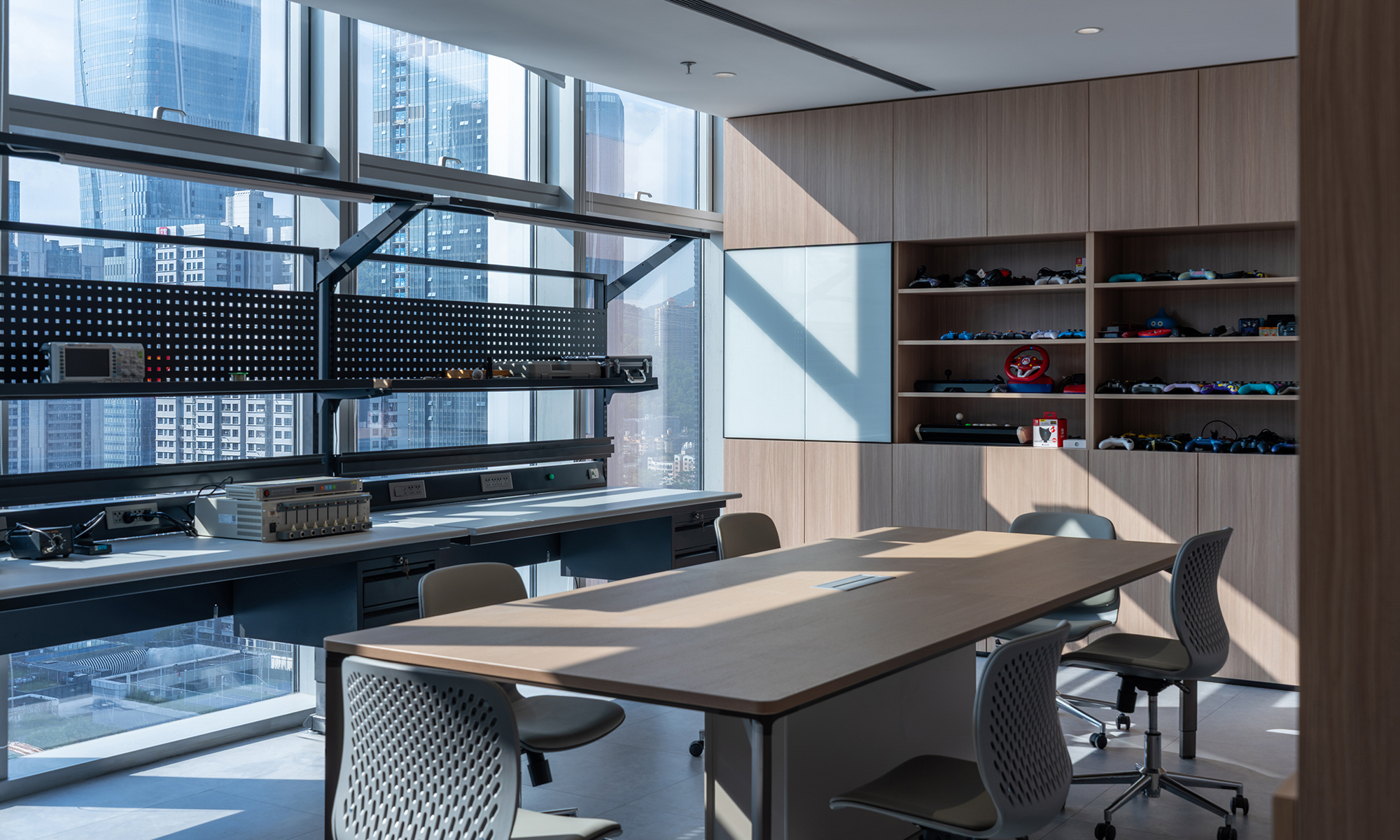
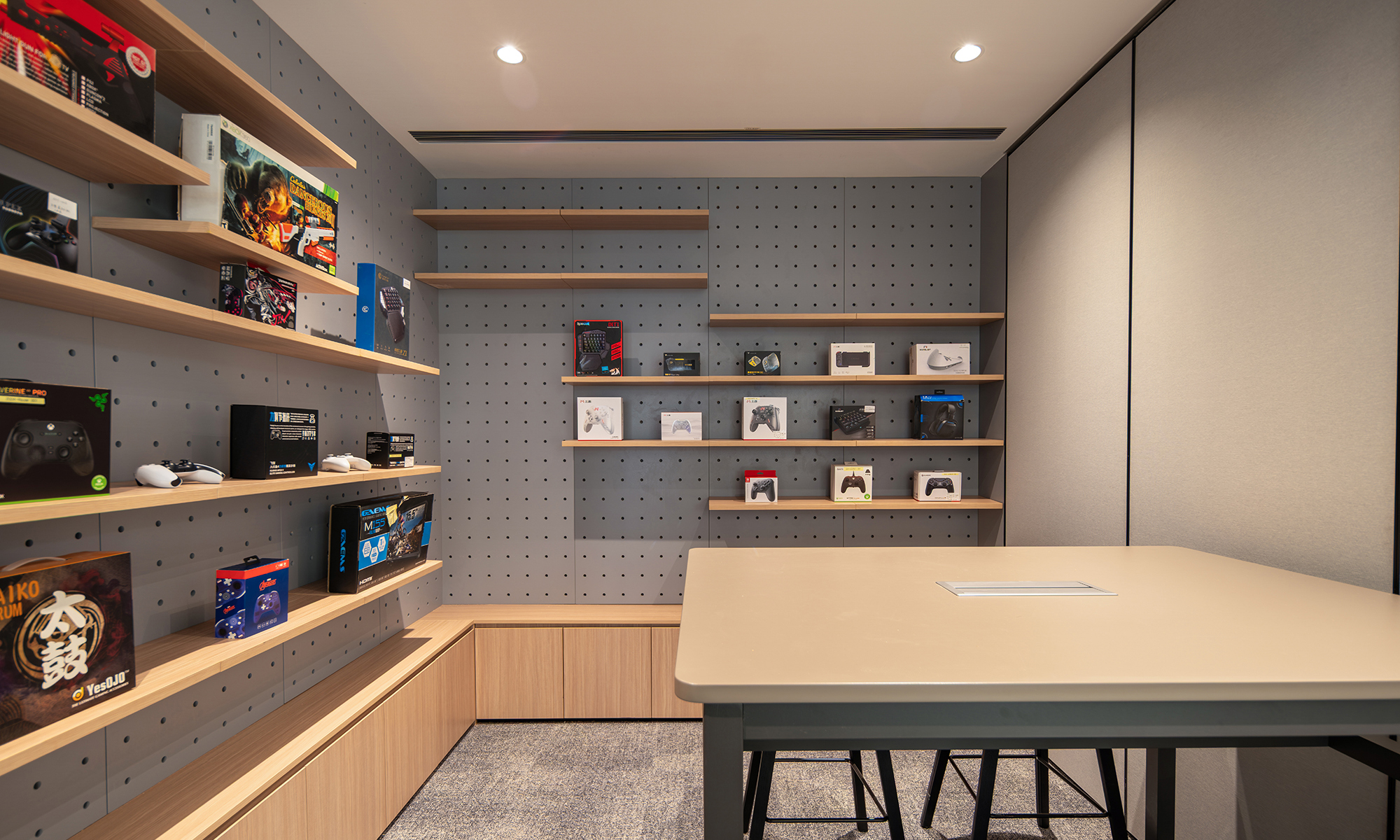
HORI Shenzhen Office
time : 2025.09
client : HORI
site : Luohu, Shenzhen, China
HORI is a long-established game peripheral manufacturer headquartered in Yokohama, with offices across the world. The Shenzhen office was conceived as a single, cohesive environment capable of accommodating the diverse activities of a globally operating company.The planning focused on organizing areas accessible to visitors and zones requiring a high level of confidentiality, while avoiding fragmentation of the space as a whole. Through repeated studies at the layout stage, relationships between circulation, lines of sight, and spatial distance were carefully examined, allowing functional requirements and spatial experience to be integrated into a unified architectural framework.At the same time, creating a comfortable working environment for employees was a key consideration. By introducing appropriate spatial margins and visual openness, the design enables a natural transition between concentration and release, reducing psychological strain even within a dense working setting.Transcending differences in function and use, the Shenzhen office is formed as a space woven together by a single architectural intent. It proposes an office environment in which corporate activity and human sensibility coexist in a balanced and unobtrusive manner.
横浜に本拠地を構え、世界各地に拠点を展開する老舗ゲームプロダクト企業・HORI。その深圳オフィスは、グローバルに事業を展開する企業の活動を受け止めるひとつの場として構想された。計画において重視したのは、来客者が立ち入る領域と機密性の高い業務エリアを整理しながら、空間全体を断片化させることなく、連続した構成として組み立てることである。レイアウト段階では、動線や視線の重なり方、距離の取り方を繰り返し検証し、機能的な要請と空間体験の両立を図りながら全体の骨格を構築していった。同時に、日常的にこの場で働く従業員にとって、集中と緩和が自然に行き来できる環境であることも重要なテーマとした。適度な余白や視線の抜けを設けることで、業務の密度が高い状況においても、心理的な負荷が過度に蓄積しない空間構成を目指している。 機能や用途の違いを超えて、ひとつの思想のもとに編み上げられた空間として、HORI深圳オフィスは、企業活動と人の感覚が無理なく共存するオフィスのあり方を提示している。