


1-7 bread @ Chang Xing Rainbow mall
time : 2024.11
client : 1-7 bread
area :52.7m2
site : Nanshan, Shenzhen, China
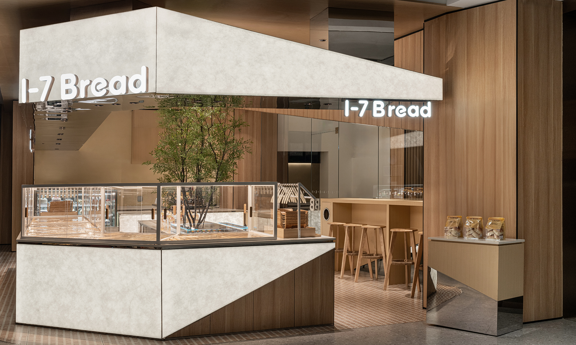
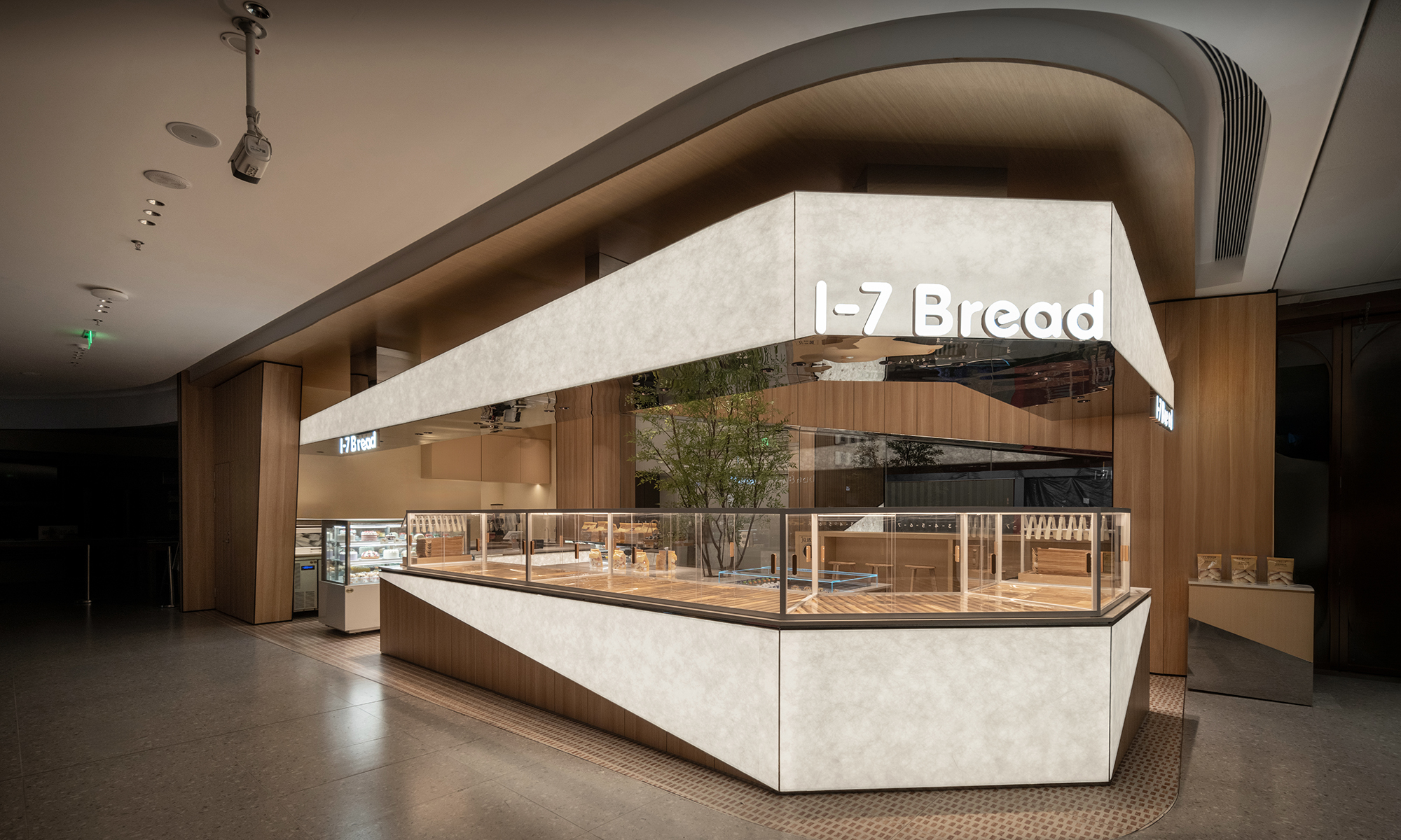
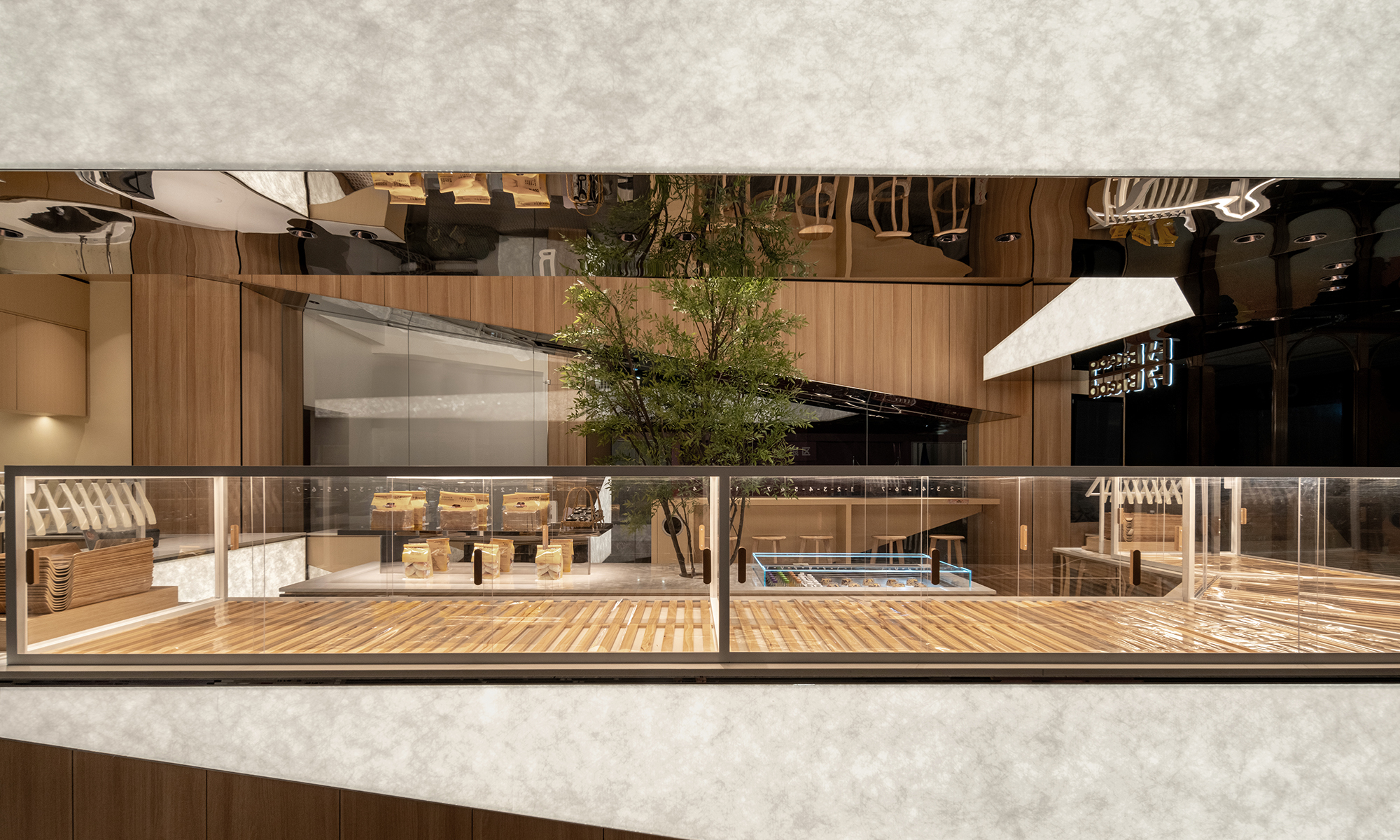
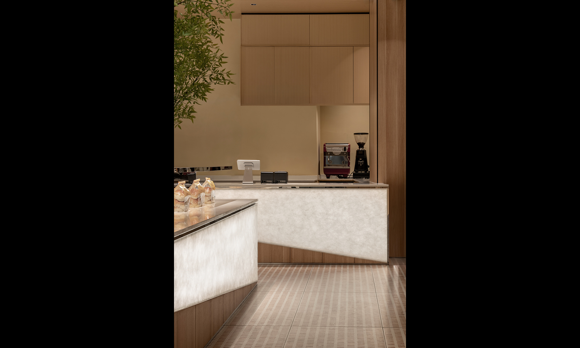
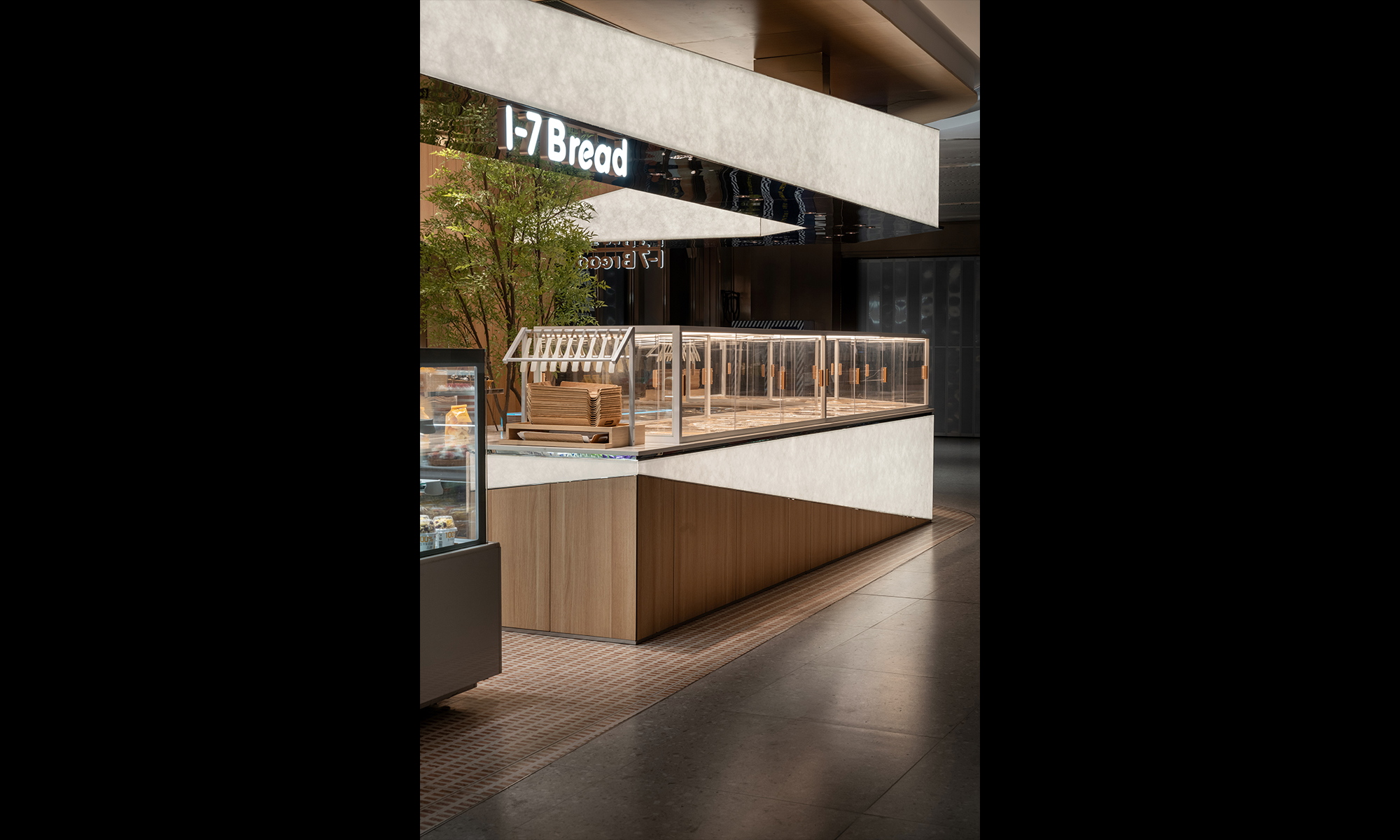
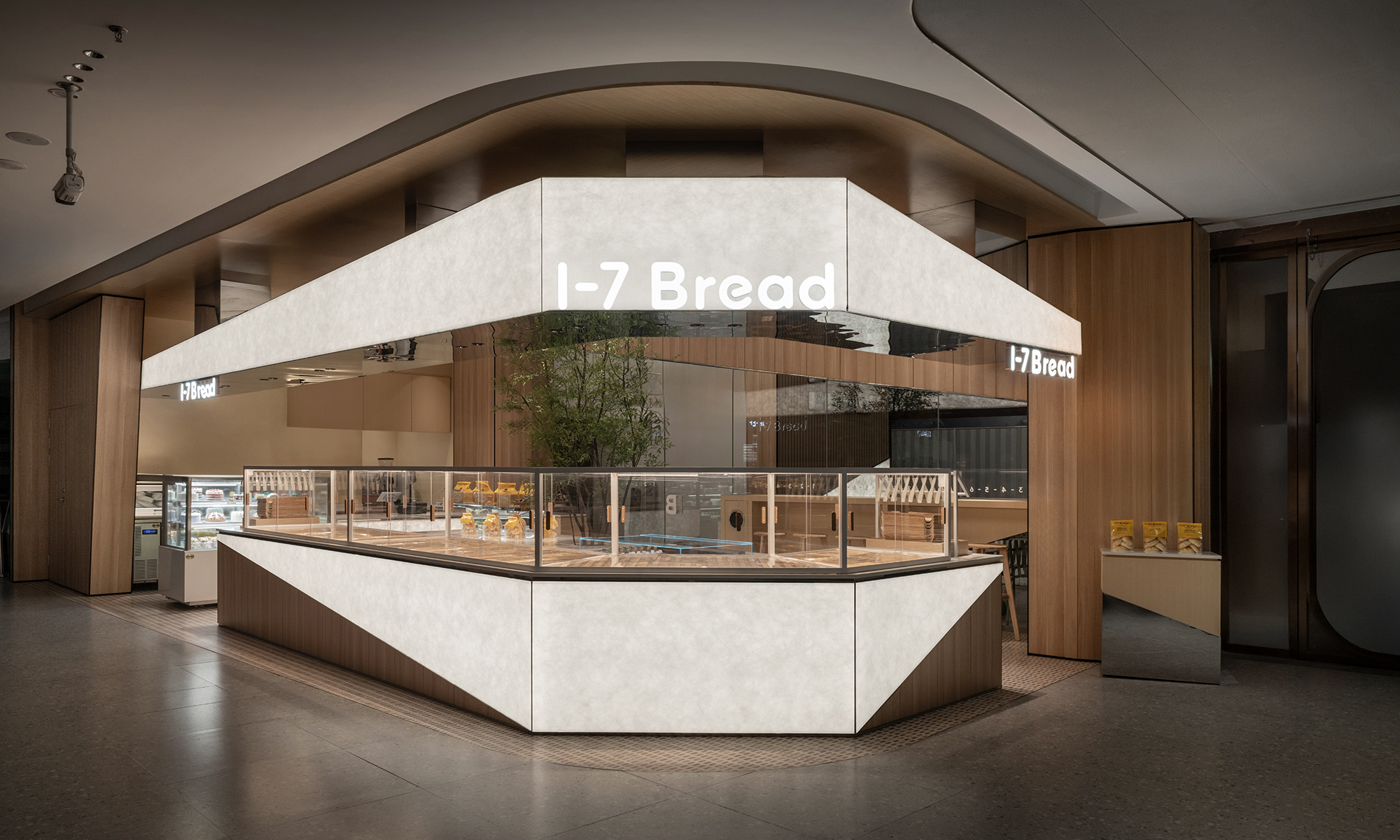
The materials used in the new 1-7 Bread store are unified across all locations to maintain the brand's world view. At the same time, the design format is intentionally not standardized; rather, each store is encouraged to adopt a unique and free design approach. While other shops of the brand have differentiated themselves with complex curves and ornate features, we believe that expressing Japanese aesthetics could be achieved instead through a minimalist and straightforward design approach.The entire store is structured around a single horizontal line as its axis, complemented by illuminated elements framed by diagonal lines set at angles of approximately 5 to 10 degrees. By designing other elements to remain as minimal and subdued as possible, we created a space that evokes the sharp impact and tension of a Japanese sword slicing cleanly through.
1-7 bread の新店舗で使用されるマテリアルは、ブランドの世界観を統一する為に全店舗で統一されています。同時に、あえてデザインフォーマットは統一されておらず、むしろ各店舗で異なる自由な設計を求められています。当ブランドの他店舗では複雑な曲線や装飾で差別化が図られていましたが、私たちはむしろミニマルで簡潔な造形で全体を構成することで、逆に日本らしさを表現できるのではないかと考えました。店舗全体を貫く一本の水平線を軸に、約5度から10度に設定された斜線に縁どられた発光部が全体像を導き出します。その他の部分は極力ミニマルかつ主張を抑えるように設計することで、日本刀でスパッと切り裂いたかのような、インパクトと緊張感を持った空間が誕生しました。
time : 2024.11
client : 1-7 bread
area :52.7m2
site : Nanshan, Shenzhen, China
The materials used in the new 1-7 Bread store are unified across all locations to maintain the brand's world view. At the same time, the design format is intentionally not standardized; rather, each store is encouraged to adopt a unique and free design approach. While other shops of the brand have differentiated themselves with complex curves and ornate features, we believe that expressing Japanese aesthetics could be achieved instead through a minimalist and straightforward design approach.The entire store is structured around a single horizontal line as its axis, complemented by illuminated elements framed by diagonal lines set at angles of approximately 5 to 10 degrees. By designing other elements to remain as minimal and subdued as possible, we created a space that evokes the sharp impact and tension of a Japanese sword slicing cleanly through.
1-7 bread の新店舗で使用されるマテリアルは、ブランドの世界観を統一する為に全店舗で統一されています。同時に、あえてデザインフォーマットは統一されておらず、むしろ各店舗で異なる自由な設計を求められています。当ブランドの他店舗では複雑な曲線や装飾で差別化が図られていましたが、私たちはむしろミニマルで簡潔な造形で全体を構成することで、逆に日本らしさを表現できるのではないかと考えました。店舗全体を貫く一本の水平線を軸に、約5度から10度に設定された斜線に縁どられた発光部が全体像を導き出します。その他の部分は極力ミニマルかつ主張を抑えるように設計することで、日本刀でスパッと切り裂いたかのような、インパクトと緊張感を持った空間が誕生しました。