


VI design for C/O DESIGN CONSULTING
time: 2022.12
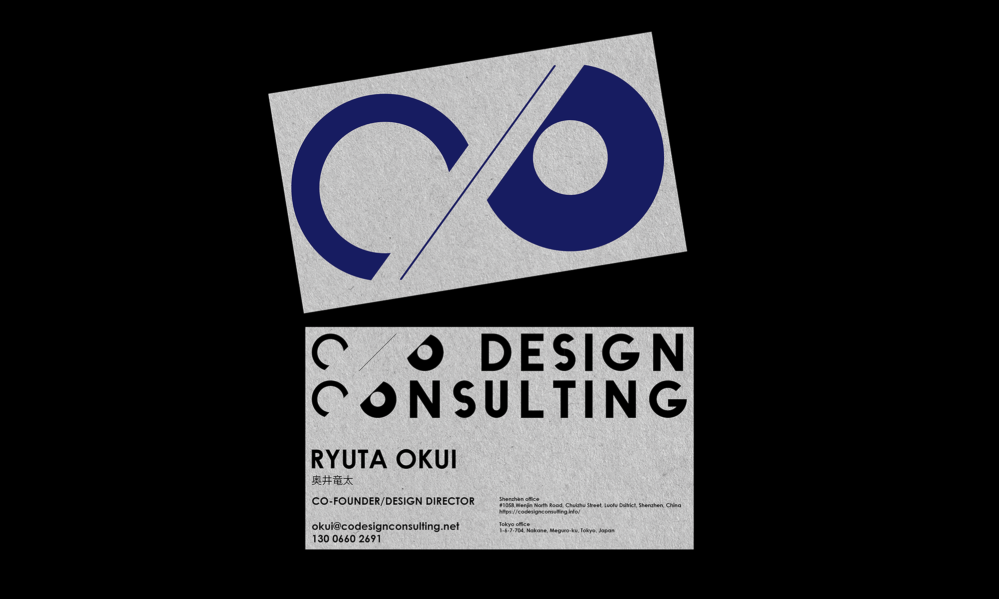
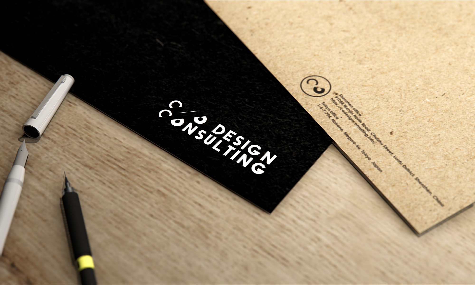
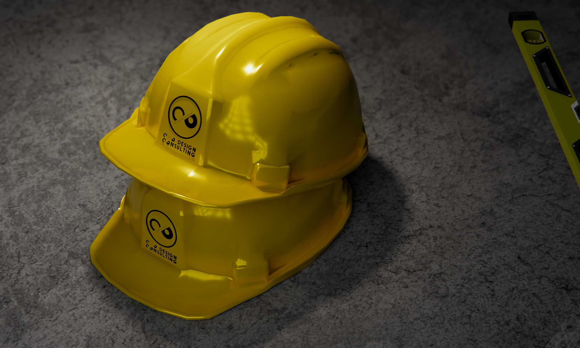
The name C/O DESIGN CONSULTING derives from the initials of its founders, and we created a simple yet impactful logo using the letters C and O and a slash mark in between. Since C and O both have a strong geometric shape that is close to circular, we believed that just placing the two letters together would be sufficient as a logo. We expressed C and O by unifying the outer diameters of the two circles and varying the diameter of the inner circle. Finally, we divided them with a slash mark. The initials of the two founders form an equivalent pair and create a shape similar to the infinity symbol (∞), which signifies infinity at the same time. We designed other English fonts following the above method. Based on these designs, we organize and design logo marks used on websites, business cards, and other items as a tool for branding.
C/O DESIGN CONSULTINGの名は創設者のイニシャルに由来しますが、このCとO、及び中間のスラッシュマークを用いてシンプルかつインパクトのあるロゴを作りました。そもそもCとOは同様に円形に近い強い幾何学形状を持っていることから、二つのアルファベットを並べるだけでロゴとして成立すると考えました。二つの円の外径を統一し、内心円の直径に変化を与えることでCとOを表現しています。最後にそれらの中間をスラッシュマークで分割しました。創設者二人のイニシャルが等価に対を為し、同時に無限を意味する∞マークに近しい形になっています。他の英字フォントは上記の操作に倣ってデザインしました。これらのデザインを元にウェブや名刺、その他の備品類に使われるロゴマークを整理・デザインし、トータルでブランディングを行う道具としています。
time: 2022.12
The name C/O DESIGN CONSULTING derives from the initials of its founders, and we created a simple yet impactful logo using the letters C and O and a slash mark in between. Since C and O both have a strong geometric shape that is close to circular, we believed that just placing the two letters together would be sufficient as a logo. We expressed C and O by unifying the outer diameters of the two circles and varying the diameter of the inner circle. Finally, we divided them with a slash mark. The initials of the two founders form an equivalent pair and create a shape similar to the infinity symbol (∞), which signifies infinity at the same time. We designed other English fonts following the above method. Based on these designs, we organize and design logo marks used on websites, business cards, and other items as a tool for branding.
C/O DESIGN CONSULTINGの名は創設者のイニシャルに由来しますが、このCとO、及び中間のスラッシュマークを用いてシンプルかつインパクトのあるロゴを作りました。そもそもCとOは同様に円形に近い強い幾何学形状を持っていることから、二つのアルファベットを並べるだけでロゴとして成立すると考えました。二つの円の外径を統一し、内心円の直径に変化を与えることでCとOを表現しています。最後にそれらの中間をスラッシュマークで分割しました。創設者二人のイニシャルが等価に対を為し、同時に無限を意味する∞マークに近しい形になっています。他の英字フォントは上記の操作に倣ってデザインしました。これらのデザインを元にウェブや名刺、その他の備品類に使われるロゴマークを整理・デザインし、トータルでブランディングを行う道具としています。